Amalia: If we have even a vaguely similar Instagram algorithm, you’ve probably seen the videos on the homogenization of branding. Or, you might have clocked the AI ads lining the subway, suddenly dressed in delicate, decorative serifs.
The serif’s return has been building for months, and then the WSJ came out with its “Skinny Font” piece. With so much noise orbiting “Blanding,” this felt like the moment to step out of our usual dialogue and let Jack take this issue solo. He, by nature, thinks about serifs and sans-serifs far more often than I do (at least until this issue). If you’re like me and not instinctively tuned into graphic nuance to the extent Jack is, you may find yourself noticing this “sans-serif epidemic,” as he once called it, more than usual after reading this.
In Issue Four, we’ll return to a conversation and unpack the larger emotional and cultural question beneath all of this: whether consumers still look for meaning in brands, why they seek it at all, and whether meaning even holds weight in a world where trend cycles now outpace loyalty.
When we speak about language in the creative industry, we’re usually referring to three things. Written language is the most obvious, exactly what it sounds like: copy, text applied to assets. Then there’s visual language, the main commodity our consumer economy trades on today, images and video. And finally, there’s graphic language, the red-headed stepchild of the three. Graphic language is the visual grammar that gives a brand or body of work its voice. It’s the system a brand, artist, or designer uses to communicate ideas, the structured vocabulary of form, color, type, imagery, composition, and motion that together express identity and meaning.
I call graphic language the red-headed stepchild of brand communication because it’s the least considered and the least understood. From an early age, we’re taught to communicate through words and images. We learn to read and to write; we learn to draw and to appreciate imagery through coloring books, picture books, and cartoons. But we spend almost no time learning how to tell a sans-serif from a serif, how kerning and rag make a block of text more legible, or how the sharp punch of red makes us feel different from the subdued calm of blue. Why is that? I’m not entirely sure. Somewhere along the way, this language was handed off to a small subset of people who call themselves graphic designers, while the rest of the world chose to remain happily oblivious to its existence. But graphic language lives in the symbols and systems we use every day — the train map that sends us to Soho instead of Williamsburg, the layouts that let us read a publication, the signage and interfaces that keep the world legible.
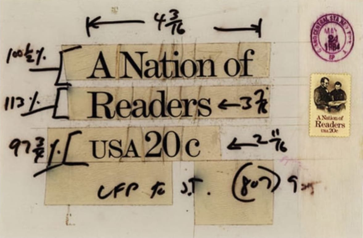
In many ways, if a word is worth a word and an image is worth a thousand, then a mark is worth a hundred thousand. Graphic language is the system that sits under words and images, directing how we interpret what we see long before content registers. What do I mean by that? Take color, for example. A red stop sign communicates on a deep, almost instinctive level long before we even read the word STOP. Through experience, we’ve learned that red signals alertness; it tells us to pay attention, to look, to stop. The same applies to typography: a serif font suggests delicacy, tradition, and thoughtfulness, while a sans-serif feels clean, modern, and utilitarian. Before we even process the words themselves, our brains are decoding layers of meaning. We’re not just reacting emotionally, as we might to an image, but responding to a system of signs we’ve been conditioned to understand over time.
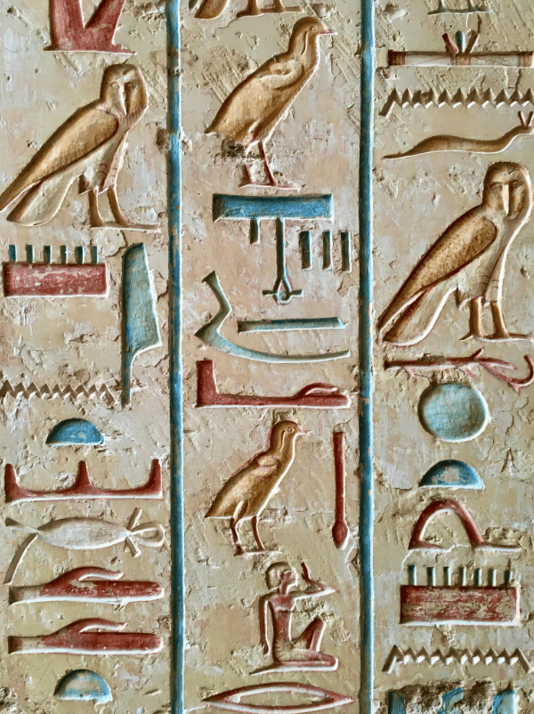
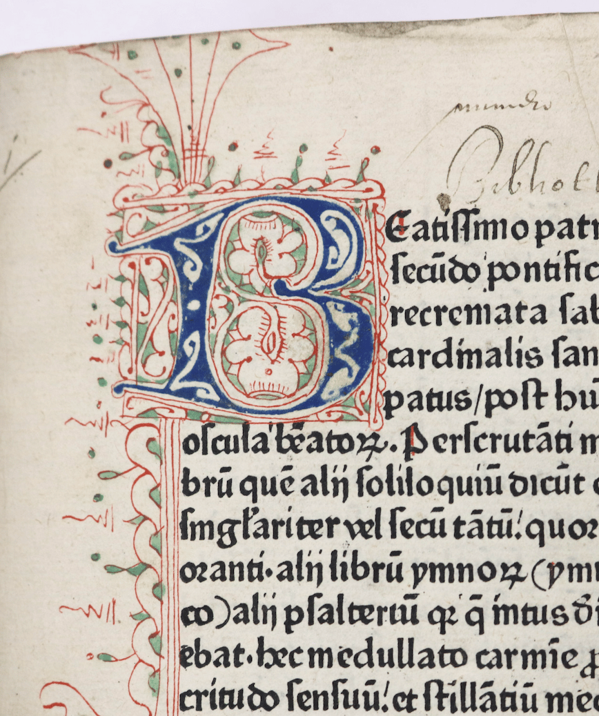
Part of graphic design’s invisibility in the broader conversation around language has to do with its youth as a discipline — the term itself wasn’t coined until the early 20th century. Humans have been combining image and text for thousands of years: from cave paintings and Egyptian hieroglyphs to illuminated manuscripts in the Middle Ages. The invention of the printing press in the 15th century marked a major turning point, introducing the concept of reproducible design and typographic layout. By the 19th century, poster art, typefounding, and industrial printing began to formalize ideas about design, decoration, and communication. But it wasn’t until 1922 that the phrase graphic design officially entered our vocabulary.
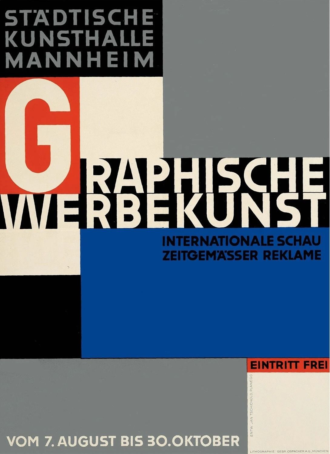
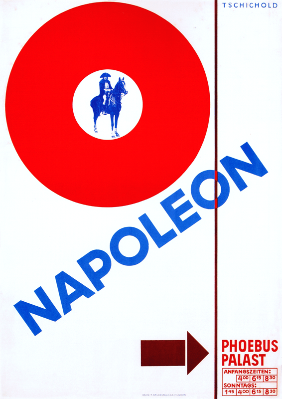
Modern graphic design grew out of a commitment to clarity. Movements like the Bauhaus and designers such as Jan Tschichold pushed for a visual language built on geometry, order, and typographic discipline. As the twentieth century unfolded, the discipline became deeply intertwined with commerce, with designers working across advertising, publishing, and the growing corporate world. Postwar pioneers like Paul Rand, Saul Bass, and Massimo Vignelli defined the identities of America’s major companies, proving that clarity and restraint could carry both cultural and commercial weight.
Graphic design long operated as the invisible force that kept the world turning. Its practitioners didn’t seek the spotlight; their goal was to make work disappear into function—helping people navigate a subway system or read a publication. Designers formed a proud, insular community, interested less in public recognition than in the respect of their peers. The wider world didn’t need to understand rag, kerning, or grids; the discipline succeeded precisely because it worked quietly in the background.

Visibility, when it happened, was intentional. Most brands embraced restraint, but when design stepped forward, it did so as a deliberate expression of personality. Paul Rand understood this balance better than anyone. His identities for IBM and UPS were playful yet precise—the striped IBM mark and the UPS shield added wit and humanity to systems otherwise defined by structure. His work proved that design could carry emotion and intelligence without sacrificing clarity.

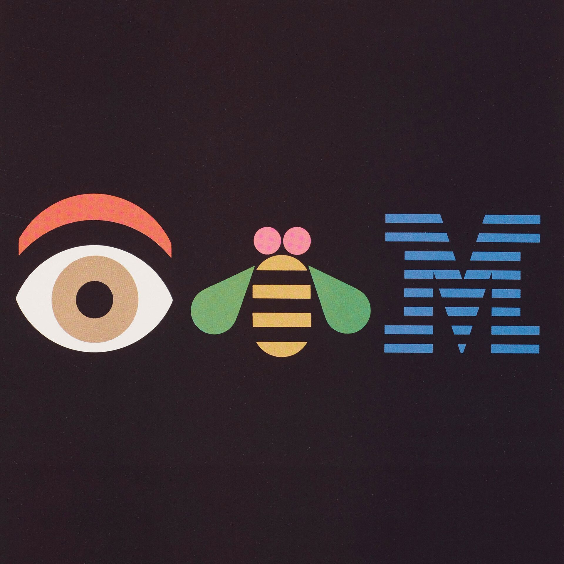


This was the natural order of things—the foundation of modern branding as it was meant to operate. Design served as a deliberate act of communication, a way to articulate meaning with clarity and purpose. Graphic language was the medium of straightforward communication, a way to make a product say a thousand words as efficiently as possible. When visible to the untrained eye, it signified craftsmanship and quality; when invisible, it guided without acknowledgment. I’ve spent the preceding paragraphs setting this up because, unfortunately, that balance no longer seems to hold in mass graphic aesthetics.
Before I get into my hypothesis on why this has happened — and how it’s affected brands as a whole — it’s best to start with an example. The next time you visit your favorite overpriced supermarket (Erewhon, Happier Grocery, Pop Up Grocer, take your pick), look at the drinks section. You’ll be met with a wall of bright colors, sans-serif fonts, and cheerful illustrations. It’s not immediately clear whether you’re looking at kombucha, a gut-healthy soda, a flavored sparkling water, a meal replacement, or a “natural” energy drink. These products are covered — almost suffocated — with graphic design. Every inch of the packaging is considered, yet the design communicates almost nothing about what’s actually inside. Graphic language is no longer a tool for expressing functionality or distinction. Instead, it signals a vague set of adjectives: new, clean, premium. It aims less to inform, and more to trigger a dopamine hit strong enough to make you grab the turquoise can, not knowing what it is, and head to checkout to spend fifteen dollars on pineapple sparkling water.

That’s not just an aesthetic miss; it’s a business problem. When packaging sells “new” instead of truth, you might win a first purchase, but you won’t earn the second. Brand equity erodes because there’s no memory hook — no functional promise, no clear benefit, no reason to believe — just a mood. Confusion at the shelf depresses repeat purchases because people can’t reliably find (or trust) what worked last time. Price elasticity shrinks, CAC rises, and loyalty gets replaced by novelty-chasing. In other words: dopamine drives trial; belief drives retention.
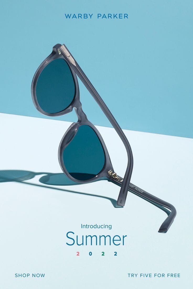
So where did it all go wrong — and how do we get back on track? In my view, much of this shift traces back to the rise of Shopify and the direct-to-consumer boom of the 2010s. Brands like Warby Parker, Dollar Shave Club, Casper, and Allbirds exploded onto the scene, backed by venture-capital funding hell-bent on disrupting legacy categories. Savvy founders identified obvious gaps in the market — brands that had grown tired, inaccessible, and ill-equipped for a new visual economy powered by Facebook, early Instagram, and Pinterest. In response, they developed a new design language to cut through: bold colors, Helvetica-like typefaces, punchy graphics, and crisp simplicity that telegraphed modernity and honesty. And it worked. Through paid social and early influencer marketing, this aesthetic — minimalist, millennial-friendly, and hyper-direct in its copy — signaled transparency and freshness. The market devoured it. Brands like Allbirds and Glossier became cultural icons, pushing the DTC model beyond price disruption into aesthetic and identity-based consumption.
Creative agencies began sprouting everywhere, mastering the new millennial aesthetic. Studios like Red Antler became engines of replication, producing brand after brand with surgical efficiency. A formula emerged and spread quickly: soft sans-serifs, soothing color palettes, lowercase logos, and friendly, hyper-approachable tone. It felt clean, honest, and modern — everything legacy brands weren’t. But what began as rebellion calcified into its own kind of conformity. The aesthetic language that once signaled freshness and transparency became the visual shorthand for safety and predictability. Every brand spoke in the same cues: flat color fields, minimalist grids, and balanced layouts that projected a gentle optimism. It was branding designed not to offend, not to polarize, not even to speak — but to blend.
The seduction of this blanding was in its promise of clarity — and the security that comes from the familiar. The world had become noisy, overstimulated, and distrusting — so brands responded by sanding off their edges. Clean typography suggested honesty. Minimalism suggested integrity. Soft palettes suggested empathy. The problem is that these codes were no longer signifiers of truth; they became visual clichés, signifying only the idea of good design. The aesthetic of authenticity replaced authenticity itself. In trying to make design more legible, we made it hollow. Typography became a vessel emptied of meaning. Color lost its emotional weight, reduced to palettes that flatter any audience. Grids became invisible prisons — systems so rational and consistent that they stripped away all evidence of intuition.
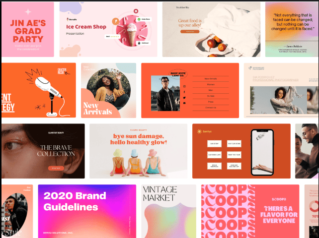
The collapse didn’t happen on taste alone — the tools helped it along. Platforms like Canva and the rise of template culture made design frictionless, then thoughtless. Decisions became defaults. Expression narrowed into a handful of presets. What once required craft became a process of assembly, executed through the same type systems, the same grid logic, the same safe compositions. It was design industrialization in its purest form: a promise of differentiation that produced sameness at scale.
There’s a quiet brutality to the order that emerged. Intuition gave way to frictionless logic, flattening expression into an aesthetic cleanliness that erased personality. It wasn’t modernism revived but modernism domesticated. Design stripped to its most compliant state, built to be legible everywhere, a universal, predictable dialect. Whatever optimism Bauhaus once held has long since drained out of the frame.
The consumer mentality has always been hiveminded — we want what others want. For decades, that desire flowed downward: luxury set the tone and mass brands followed. But in the 2010s, the direction reversed. The DTC boom rewired the visual definition of “new,” “thoughtful,” and “premium,” and luxury, terrified of seeming out of touch, absorbed the very language that once borrowed from it. The stripped-back sans-serif aesthetic began infiltrating couture houses. One by one, heritage brands abandoned century-old ornate logotypes for neutral modernism: Burberry, Balenciaga, Balmain, Celine, Berluti, Saint Laurent. The serif disappeared; the character disappeared with it. What had once been typographic signatures — ligatures, contrast, the trace of a human hand — were replaced by frictionless wordmarks built to scale across screens but incapable of carrying story.
Luxury’s pivot to neutrality wasn’t evolution; it was fear. Logos had to work as avatars legible at forty pixels wide, not monograms carved into stone. The verticals that once defined luxury — heritage, craftsmanship, time — were replaced by horizontals: adaptability, uniformity, speed. The very quality that once distinguished luxury became the thing it sacrificed in pursuit of relevance. In stripping away their typographic idiosyncrasies, these brands erased the physical markers of prestige that had taken decades to build. The logo, once a signature of difference, became a placeholder for belonging. Luxury traded its dialect of distinction for the universal, predictable dialect of the feed. The serif’s quiet humanity gave way to the sans-serif’s brutal efficiency. Every brand wanted to look timeless, but they all ended up looking of the same time.
This shift has had far-reaching effects. What started as an aesthetic trend has reshaped how brands communicate, what they value, and how consumers connect with them.
The most obvious effect is the loss of identity. When every brand uses the same color palette, typography, minimalist structure, and voice, the visual field collapses. Distinction disappears. The irony is brutal: in chasing a look of modernity, brands erased their own sense of time. They’ve adopted a system so polished and efficient that it renders them invisible. The language of modern design has become a universal tongue that everyone speaks fluently but no one remembers.
The emotional consequences run deeper. Graphic language once acted as a mirror for human intuition — a quiet translator of feeling into form. But when it’s stripped to its most functional elements, something vital goes missing. A serif doesn’t just decorate a word; it anchors it in tradition. A hue isn’t just a choice of color; it’s a psychological frequency. Design becomes the aesthetic of legibility, not of feeling. And as identities grow more generic, they lose cultural equity — the sense of care, craft, and intention that makes a brand believable.
Creativity suffers too. As brands become dependent on frameworks optimized for scalability — Figma templates, brand toolkits, modular grids — the work shifts from imagination to maintenance. Designers are no longer encouraged to explore the edges of visual expression; they’re tasked with reproducing systems that already work. The result is an industry that rewards precision over risk and fluency over invention. Everything starts to feel frictionless — and frictionless things rarely move us.

But the deepest consequence is cultural. Graphic language, at its best, orders the world and gives visual shape to meaning. When that language becomes uniform, the world starts to feel more homogenous. Our supermarkets, our screens, our streets all begin speaking in the same voice. We lose the poetry of difference. What’s at stake here isn’t just branding — it’s culture becoming less expressive, less surprising, less alive.
If brands want to regain their sense of soul, they need to rediscover the purpose of graphic language — not as surface, but as substance. Form must become intentional again. Color must carry feeling. Type must have opinion. The goal isn’t to reject clarity, but to reclaim personality within it — to remember that legibility and character can coexist. Brands have to resist the lure of safety and instead design with conviction. They must dare to be specific again. The brands that will survive are those that remember that the mark still matters — that graphic language is not just a tool for order, but for identity, memory, and belief.
We’re already starting to see a reversion — a quiet but deliberate move away from the stripped-down neutrality of the past decade. After years of flattening their identities into interchangeable sans-serifs, brands are rediscovering the value of craft, heritage, and distinction. Burberry is the clearest signal of this shift. In 2023, the house reinstated its equestrian knight and revived a serif logotype drawn from its early-1900s archive — a move that read as both aesthetic and strategic. In periods of economic uncertainty, heritage becomes a form of assurance: a way to signal longevity when everything else feels temporary. Consumers look for brands that feel anchored, not weightless, and typography becomes one of the few visible indicators of that stability. Saint Laurent has begun reintroducing archival motifs and serif marks as well. What once read as bold minimalism now reads as generic, and brands are waking up to the reality that neutrality doesn’t differentiate. The pendulum is swinging back: the serif has become a mark of confidence, a signal of origin.
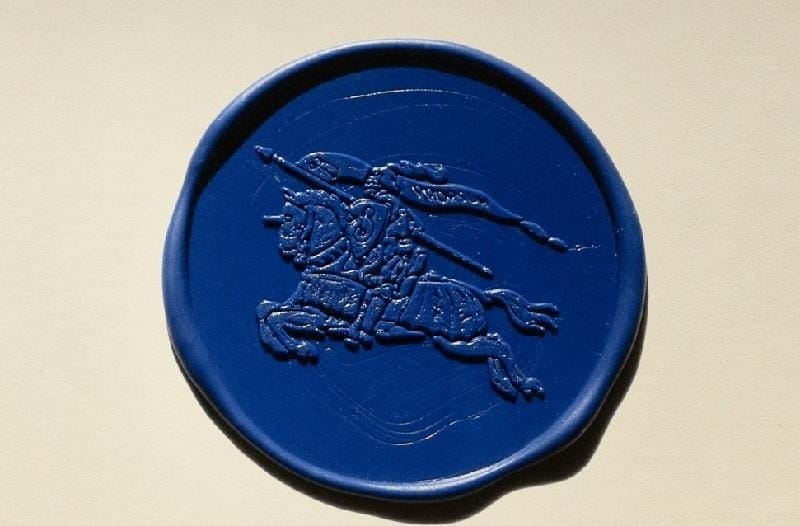
This doesn’t mean every brand should rush to resurrect a serif or repaint their packaging in saturated color. The answer isn’t aesthetic reversal — it’s intent. Graphic design isn’t about what looks “new” or “old,” “minimal” or “ornate”; it’s about constructing a world, a coherent visual environment that reflects how a brand sees itself and how it wants to be seen. Minimalism was never the problem — the emptiness behind it was. Style became detached from substance, and design drifted into performance instead of meaning. The shift we’re seeing now isn’t nostalgia; it’s a return to authorship. Design, when wielded with intention, becomes a form of storytelling — an expression of values, memory, and worldview. A serif or a grid only matters if it belongs to the brand’s truth. The real evolution will come when brands stop designing to fit in and start designing to express belief.
Graphic language is, after all, a mirror of thought. When it’s reduced to style, it flattens meaning; when it’s treated as strategy, it builds worlds. The next era of design won’t hinge on what replaces minimalism — it will hinge on purpose. Every line, color, and curve carries the potential to shape belief, to signal how a brand thinks, not just how it looks. The question isn’t serif or sans, maximal or minimal; it’s what the form makes people understand about who we are.
The future will belong to brands that resist the comfort of clarity and chase character instead — brands that use visual language not to neutralize meaning but to charge it. At its core, graphic design is one of the few universal languages we share, a system that translates belief into form. When it’s reduced to trend, culture flattens. When used with intention, culture deepens. The work ahead isn’t to choose between past and future; it’s to return design to what it was always meant to be: making ideas visible, making meaning tangible, and making people feel something real again.