Amalia speaks with Kartik Tuli, Creative Director at Lemon, as an extension of Jack’s Blanding Issue last month.
Kartik’s work treats systems not as constraints, but as goalposts for creativity and foundations for longevity. Formally trained in classical graphic design principles such as grid systems and typographic hierarchy at RISD, and later shaped by working within the established frameworks of 2x4 for clients including Prada, Miu Miu, and Chanel, he approaches design with precision, always focused on creating work that endures.

Amalia: What first pulled you into graphic design? Was it an early obsession, or something that clicked later?
Kartik: As a young kid I was obsessed with my father’s vinyl collection. Maybe part of it was his reverence for the collection and the music that drew me in, but the cover designs were what made me stay. Every record had a different story to tell. The music was felt before it was heard.
Those records introduced me to graphic design in its simplest form, even if I didn’t have the language for it then. Bold creative expression paired with a clear, considered information structure. Knowing the format of a record sleeve made the variations and reinterpretations feel exciting rather than confusing. Design gave way to artistic expression.
Amalia: Do you have a record that you remember that embodies this particularly?

Kartik: Milt Jackson’s “Wizard of the Vibes” comes to mind. This album brought me to Reid Miles and his famed sleeve designs for Blue Note Records in the 50s/60s. The way this man made letters dance to the tune of Monk & Coltrane is no joke!
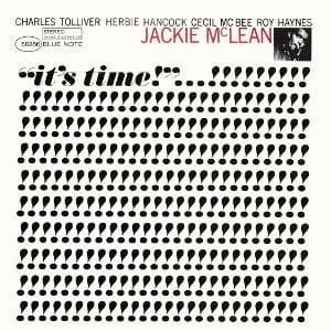
"It's time" by Charles Tolliver. The repetition of letters becomes musical, theres a rhythm to it.
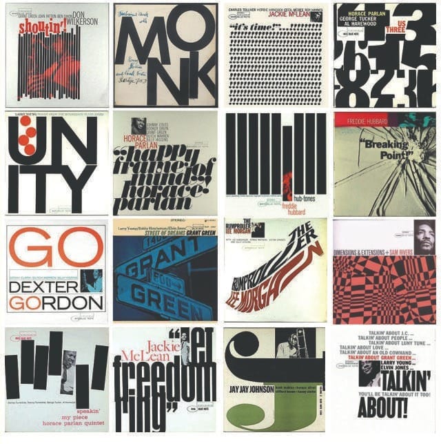
A selection of Reid Miles' designed covers.
Amalia: I like the album cover as a lens for thinking about graphic design because it sits between expression and responsibility. A record sleeve can read as pure artistic output, color, image, typography, mood, but it only works because it carries meaning that must be understood. The artist’s name, the title, track listings, parental warnings. These elements require order. Without structure, the work fails at its most basic task.
But that logic assumes the work is responsible for guiding meaning. Not all work is. Some practices deliberately resist clarity. In graphic design, this shows up in work like David Carson’s, where legibility is destabilized and disorientation becomes part of the point. In fine art, it is even more explicit. In the work of Jackson Pollock, meaning emerges through ambiguity and the refusal of a single reading. At that point, structure is no longer doing explanatory work. If great design is usually about guidance and legibility, are there moments where design isn’t necessary?
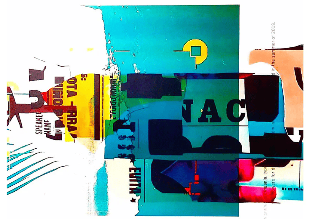
David Carson
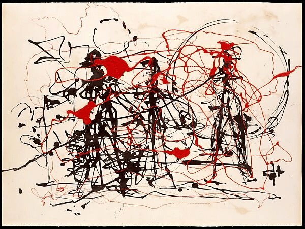
Jackson Pollock
Kartik: I don’t really think there’s any scenario where design isn’t present. Even when something doesn’t feel designed — like a Pollock painting — there are still considerations at play. Just the act of constraining something to a rectangular canvas is a design decision. You’re closing the lens. Whether you want people to meet you at an exact POV, or bring their own interpretations, there still has to be a pathway that guides the viewer. That’s what design is for: Pollock’s randomization is the system he uses to wrangle his subconscious, which, through repetition, becomes his vernacular.
Amalia: It’s interesting to look at the difference between systems that guide interpretation versus instruct it. Artists like Nora Turato and Barbara Kruger explicitly consider the viewer from the outset. Their work is linguistic and declarative. Designed to be read and interpreted. Language becomes the artwork, and in Turato’s case, she plays with legibility as a tool for making sense of the world.
Which makes me want to flip the question: would you say graphic design that exists for legibility’s sake can be a form of creative expression itself?
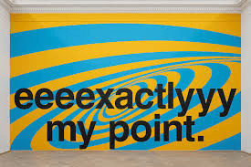
Nora Turato
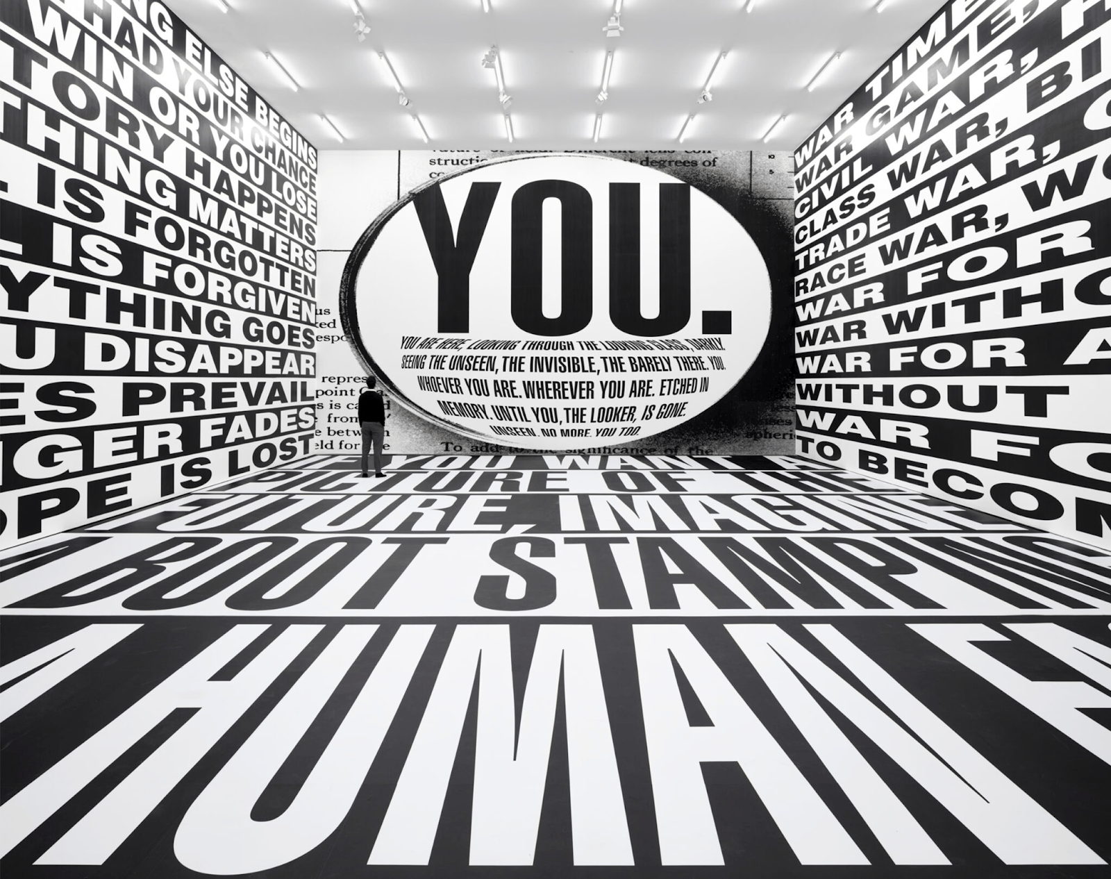
Barbara Kruger
Kartik: The only design philosophy that can truly cater to everything, in my mind, is legibility — but not legibility for legibility’s sake alone. Barbara Kruger seeks to cut through the clutter to deliver politically poignant messaging, while Nora Turato’s legibility plays on a shared understanding of linguistics (not very different from Reid Miles, mind you).
What’s interesting to me is that this is not very different from the informational lettering you see on airplanes; there is an inherent dumbing down of communication to cater to the broadest audience possible. But that’s also why it works.
When intention is so clear you don’t have to think about it twice, that’s when graphic design is at its best. And that, in itself, is a form of creative expression.


Amalia: To bring this back to the era of blanding, could the problem be a misunderstanding of graphic design as a neutral instrument rather than creative expression, even in its most systemic manifestations?
Kartik: What is often overlooked is the authorship design wields. Creative expression in design is grounded in heterogeneity. In the same way that the instructions in a plane manual can’t be applied to the subway, a brand’s codes can’t be transplanted onto another without losing meaning. Homogeneity flattens a brand's voice. No two brands, and no two world systems, are ever the same, which is exactly why a single visual language can’t serve them all.
What’s really lacking is point of view. Most brands feel uncomfortable attaching itself to a specific identity because trend cycles are so fleeting. Brands gain more by constantly reinventing themselves — turning reinvention into the expectation — so they can appeal to multiple audiences and keep signaling that they’re “with the times”.
Amalia: What strikes me is how clearly the loss of authorship shows up in practice. It’s not just that brands are chasing fleeting trends driven by the algorithm, it’s that taste itself has become symbiotic with those cycles, increasingly siloed as a result.
As a New York–based woman in her mid-twenties who naturally gravitates toward (and I even hate to say it) a minimalist aesthetic, I’m constantly inundated with brands that have all collapsed into one: these almost-there The Row– or Toteme-adjacent lookalikes. It’s the antithesis of minimalism itself — an excess of output required to sustain the appearance of restraint.

I think Carolyn Bessette-Kennedy would cry if she knew her legacy had been flattened into the “quiet luxury aesthetic”.
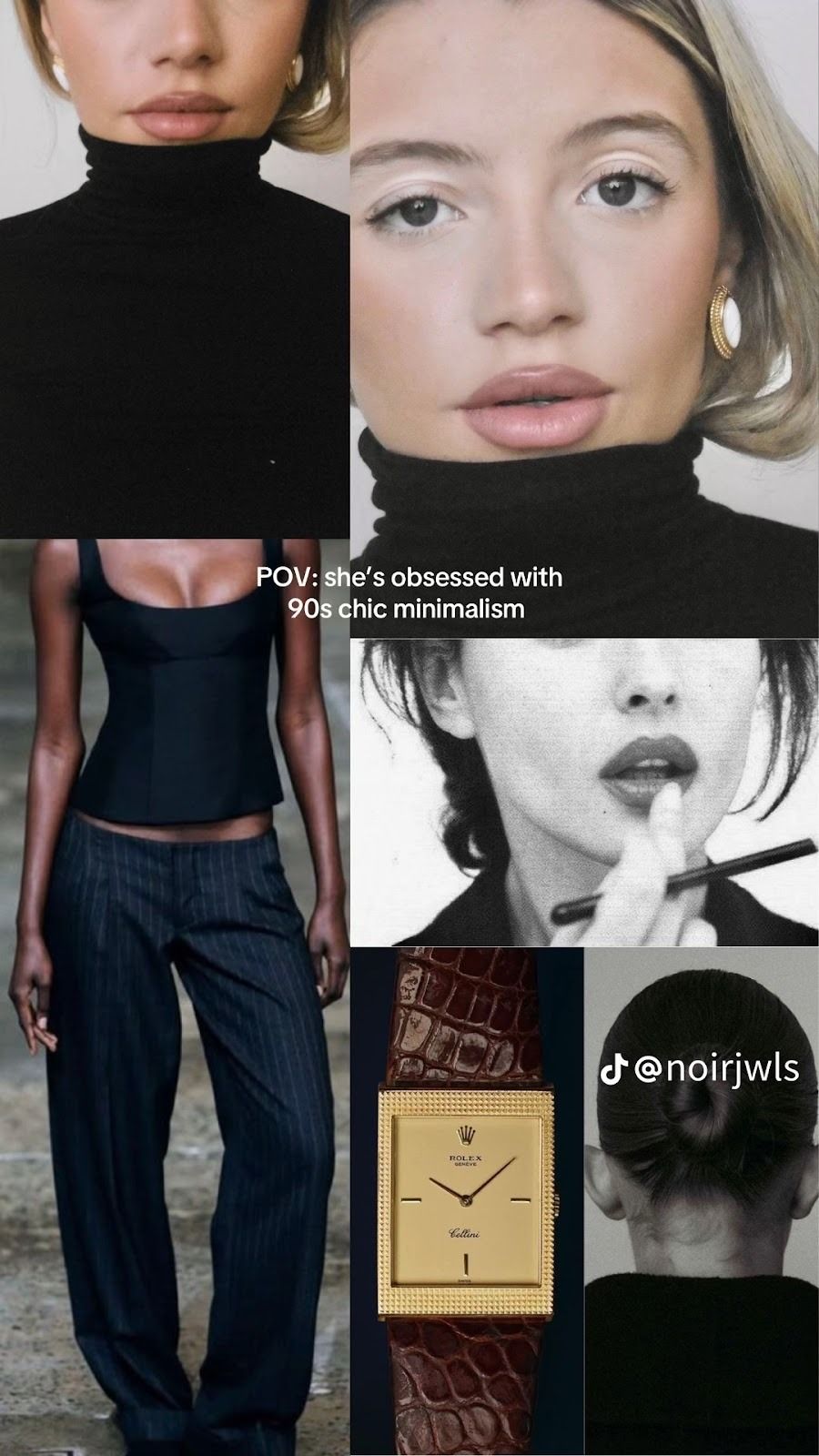
The same goes for any aesthetic tendency: once you’re in it, the algorithm only pushes you deeper, unless you very deliberately curate your way out. It's gotten to the point where I’m tempted to ignore my own taste instincts and start wearing purple polka dots with yellow stripes just to react against it.
The algorithm has fetishized aesthetics. I’ve seen agencies positioning themselves as experts in branding for “Gen Z women,” where, upon seeing their work, I assume they think we’re all the same person — living and breathing one aesthetic.
And while I ideologically agree with you that brands that only sell vibes kill retention, I sometimes catch myself nearly convinced that this thesis holds in a world where trend cycles are moving faster than loyalty itself. The proof, increasingly, is in the numbers and the brands that endure are the ones able to evolve quickly without losing their core point of view.
Kartik: It’s difficult to defend brands that function this way. When trend cycles dictate the creation of brands operating on a ‘pump and dump’ model — with revenue built on fleeting trends and numbers to prove it — who can really argue with that? As long as you can convince a 14 y/o to click buy I suppose you have achieved your goal. Would I call that good design? No. Good design is one that goes beyond the trend, and enables a brand to build legacy, to build loyalists because that is how you stand the test of time as a brand. Loyalty will always end up being the more profitable, more appreciated, more lauded form of brand building.
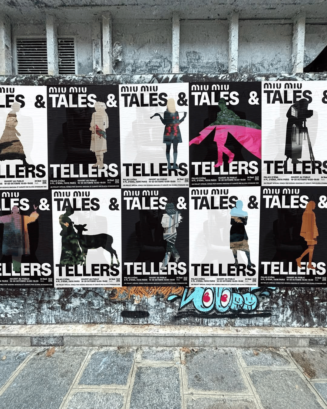
Amalia:In lieu of brands that stand the test of time, Miu Miu comes to mind of course. I know you worked on their Tales and Tellers Exhibit in May. Can you walk me through your role on the project?
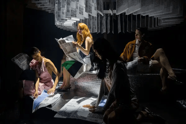
Tales and Tellers was a performance–experience–art installation that Miu Miu put on in New York earlier this year in collaboration with the Polish artist Goshka Macuga. You can read more about it and other cultural installations that they do here
Kartik: Tales and Tellers was part of a multi-layered project called “Salt Looks Like Sugar”, where polish artist Goshka Macuga explores the concept of truth and its representation in the uncanny world we exist in today. What are we meant to believe as consumers of culture & media? What’s real vs fabricated? How can truth be defined in a polarized world?
Goshka came to us and said: I want you to make a newspaper of the future. That immediately raised the contradiction as the traditional newspaper will likely cease to exist.
So, how do you communicate these tensions whilst still creating a physical newspaper? Our answer was to lean into it with a tongue in cheek approach.


Kartik: The Truthless Times featured vague headlines, each paired with two QR codes. Scanning either code led to a completely different interpretation of the same headline, forcing the reader to choose how the news unfolded — mirroring how media operates today, where facts are framed to serve different audiences. It functioned as a commentary on both the present and the near future, where ambiguity is no longer questioned, just accepted.
It was cool because Miuccia saw the newspaper and became completely obsessed with it. She scrapped her entire upcoming show concept overnight (which she does quite often apparently) and decided the runway would revolve around this newspaper instead.
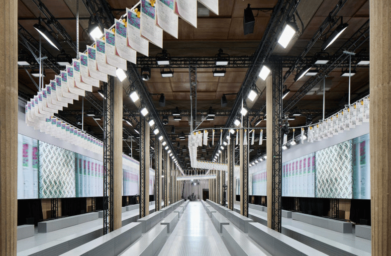
They built a newspaper factory-esque conveyor belt on the ceiling for models to walk beneath. Beyond the runway they also used the newspaper as a backdrop for show arrivals.

Kartik: The object of a newspaper shifted from a vessel of information into texture — almost like a tapestry. It doubled down on the joke. The newspaper became a utilitarian material — like when it’s used to wrap food, or protect surfaces — stripped of preciousness. That, in itself, became another commentary on how we value information and the media today.
Amalia: In creating The Truthless Times, were there any takeaways from how they approached graphic design as a tool for brand expression?
Kartik: What stayed with me is how clearly these ideas were communicated through design alone. It went beyond utility and became art. Typography, headlines, QR codes — all of it working together to communicate something conceptually complex, but instantly legible.
It’s the perfect example of when graphic design goes beyond functionality and into creative expression by taking a poignant stance on socio-political concepts.
Amalia: Miu Miu does this exceptionally well. Yes, it sells clothes, but more importantly, it asks people to think about the world those clothes exist in. It’s cultural authorship that guides its success.
It makes me question why they still execute on their Traditional luxury activations. Store openings and in-store collaborations that operate at a more service-level, transactional layer don’t hold nearly the same cultural weight.
Tales & Tellers pushed audiences into a broader world: one that challenged them intellectually and culturally. People weren’t just buying clothes, but buying into a set of values, references, and ways of seeing. In an era defined by trend cycles, homogeneity, and risk aversion, that distinction matters. Without an anchor, cultural relevance collapses into aesthetic alignment and meaning never has the chance to form.
Kartik: Right. Where brands fall short is that they completely cut themselves off from the world — they’re pretending it doesn’t exist. Miu Miu is doing the opposite. It’s facing the music.
It’s trying to provoke you, intellectually and visually. And by being a bit transgressive, it’s saying: this is what’s happening right now. Either we comment on it, or we actively move against it. That’s what makes it interesting.
Amalia: And I think a lot of that comes down to Miuccia herself. She’s a genius at this. Especially when you look at how Miu Miu was conceived as the slightly mischievous sister of Prada, it creates space for that more experimental, irreverent approach.

Kartik: Totally. And if you look at it through a graphic design lens, the logo alone says everything. You have the rounded typeface which is cute but the stencil cuts take it to a transgressive, rebellious place.
Amalia: I often think about whether the kind of brand value that comes from deep cultural relevance , as Miu Miu has achieved, can translate to brands with much narrower product SKUs.
CPG brands, especially beverages, feel particularly vulnerable to blanding. You see it clearly in the Erewhon-esque “fun drinks” aisle, as I like to call it: endless variations of the same aspiration applied to essentially the same product. That’s where Miu Miu’s position becomes instructive; not because it sells aspiration, but because storytelling is foundational to how value is constructed. And in an era of luxury decline, consumers are increasingly discerning about what they’re actually buying into, so that value is important.
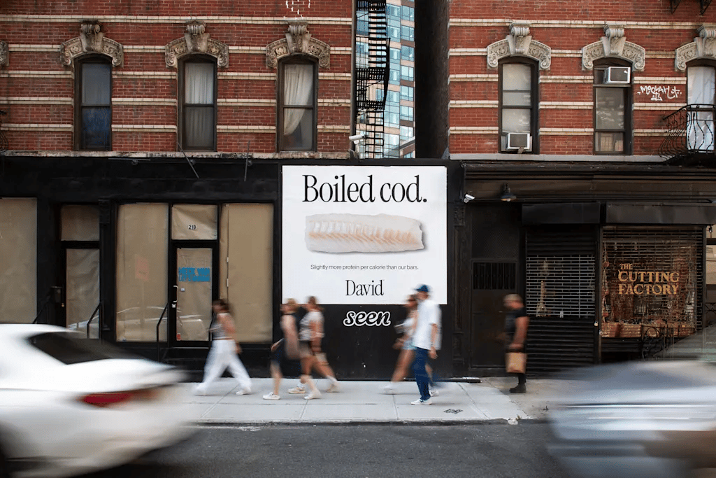
Of course storytelling matters in CPG — David Protein is a case in point (The Boiled Cod campaign was pure genius) — but the decision-making is fundamentally different. Choosing a protein bar is low-stakes, and if the product doesn’t deliver, branding can only go so far, no matter how enticing the calorie-to-protein ratio is.

With fashion, it’s different. If I’m drawn to a brand doing something genuinely interesting, like Miu Miu, I want to wear it because it signals alignment with their worldview. Clothing becomes identity — something you live in, can style and fold into your own narrative. It blends into lifestyle in a much more enduring way, and it’s far less dependent on immediate sensory preference than a food product.
That’s why I don’t think a brand like David Protein could — or should — go as philosophically deep as Miu Miu does with something like Tales & Tellers. It would feel forced rather than earned. Which gets to the real distinction here: imposed meaning versus authentic brand meaning — meaning that stays true to the product, the category, and the role it plays in someone’s life. Where strategists often fail is in fabricating meaning instead of extrapolating what already exists at a brand’s core; there’s only so much a brand team can do in a product story’s favor.
Kartik: This connects to a trend that’s become a real pet peeve of mine: faux heritage and faux sophistication. You see it in logos that use polite, shortened serifs — not even real serifs — just enough to signal “heritage” or “premium” without actually earning it.
A lot of these brands borrow surface-level cues — typefaces, proportions, historical references — without understanding the systems behind them. It turns into aesthetic signaling rather than identity. When brands avoid committing to a point of view in favor of constant reinvention, the work may be technically competent, but it’s hollow. It looks right, but it doesn’t mean anything.
Amalia: There are brands that actually do heritage well though. One that really stands out is Vacation Inc. They don’t try to do too much, which is where a lot of CPG brands go wrong.
Vacation stays true to its identity while playing with this vintage sunscreen look that no other sun-care brand has managed to replicate. Everything else is either clean beauty or very clinical, functional SPF. So they stand out. It’s a great example of a CPG brand building a real world.


Kartik: Totally. They’ve leaned into it. They picked a time period and committed — this is what we’re doing.
The issue with faux heritage, for me, is when brands act like that’s not what they’re doing. Vacation is very upfront. They’re obviously not a brand from the ’80s or ’90s, but they own the aesthetic and they’re in on the bit.
Jacques Marie Mage is a good example of faux heritage gone wrong. There’s real craftsmanship there, and a lot of premium production processes rooted in tradition. But visually, it’s super maximalist — crests, symbols, all of it — and it’s trying very hard to feel historic. That’s where it becomes fictitious. It’s designed to imply heritage rather than let it exist naturally.
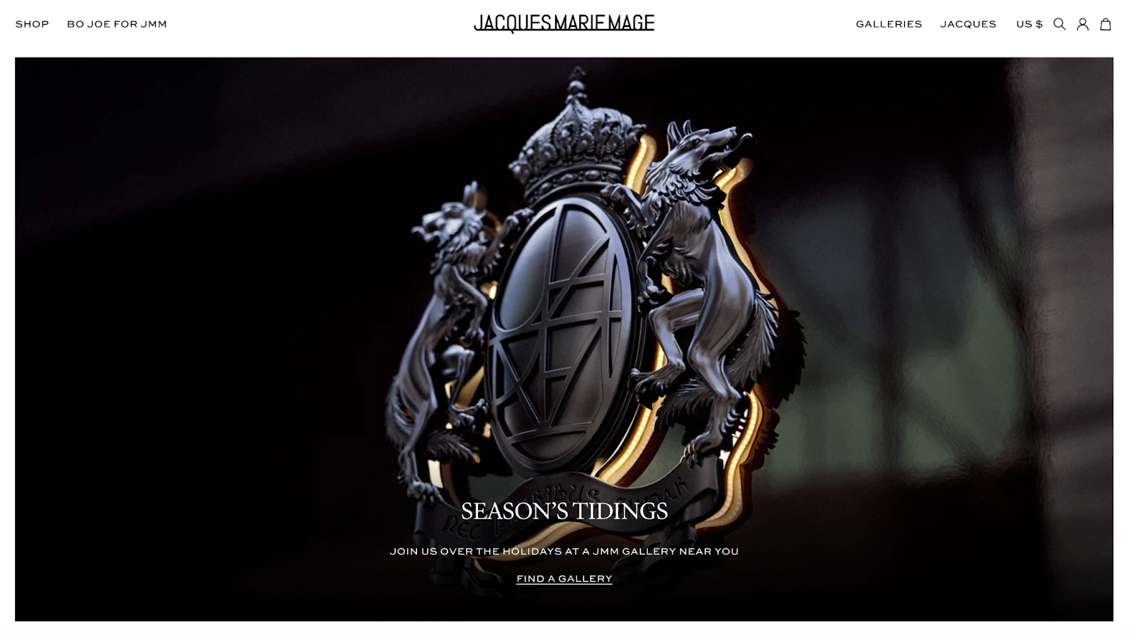
The crest on the Jacques Marie Mage website.
Amalia: So your stance is that heritage can’t be designed? It has to already exist for it to work, both from a branding and graphic design perspective?
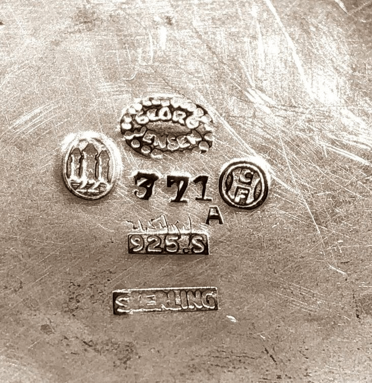
An appropriate use of crests: trademarks found on British silverware.
Kartik: Yes exactly. Heritage is earned over time. Historically, craftsmen needed a mark or symbol to stamp their work when it traveled — something that signaled quality and authorship. Over years, that mark accumulated meaning. Brands like Jacques Marie Mage mimic the look of heritage instead of creating symbols rooted in the world we live in now.e
Vacation exaggerates the aesthetic to such a degree that the irony is instantly clear — from the packaging to the bottles themselves. They’re not pretending. So yes — faux heritage can work. But only when the brand admits what it’s doing.


Amalia: I intentionally avoided going too deep on AI in this issue, that’s a conversation for another time. But AI-driven templatization does seem to support trend-led branding and projected meaning. When design processes no longer require deep thinking about product-to-brand relevance, blanding accelerates — the stages where meaning would normally be interrogated simply collapse.
Do you think bypassing those technical processes is a problem — like not learning grammar before speaking a language? Is something lost when you don’t go through that granular phase?
Kartik: On the technical processes, honestly? No. Because the technical part of graphic design was never really the how — it was the why. Why grids exist. Why hierarchy matters. Why smaller type needs more space. That’s all rooted in how humans perceive things (legibility). The rest was busy work. Now that it’s automated, it’s clear it never needed that much focus. My professors actually anticipated this, which is why they emphasized learning how to think and use tools conceptually, not mastering software.
But when everyone can generate a minimalist system, a maximalist one — whatever the prompt is — the real question becomes: what does someone make that actually surprises you? That’s where creativity will live: in breaking out of those categories, not reinforcing them.